Theme
We wanted a clean BTO home design. Our requirement was to have a home that is clean-cut, easy to maintain, and nothing that was too expensive. Space wise, we will only ever use the bedroom. I’ll be gaming or using the computer. PQ will only be sleeping or using her phone. We won’t be buying a TV, because the both of us don’t ever watch TV. There also won’t be a sofa, because we will just retreat into the bedroom. We also had an idea to minimise the use of wood, to make maintenance easier, but that was more of a stretch goal than a cardinal rule.
Shao Jie came back to us at the second appointment with an eclipse-themed design. We liked it. The eclipse theme encapsulates transitions in the use of space. Spatial usage is marked out and differentiated by increasingly darker shades of gray. The important thing was the design emphasised cleanliness and fuss free maintenance through the choice of materials. He also accommodated our lack of a sofa and TV console by reconfiguring the living room. We liked his idea to hack the MBR wall to combine the bedrooms. We’d only be using the MBR and this would make our room spacious.
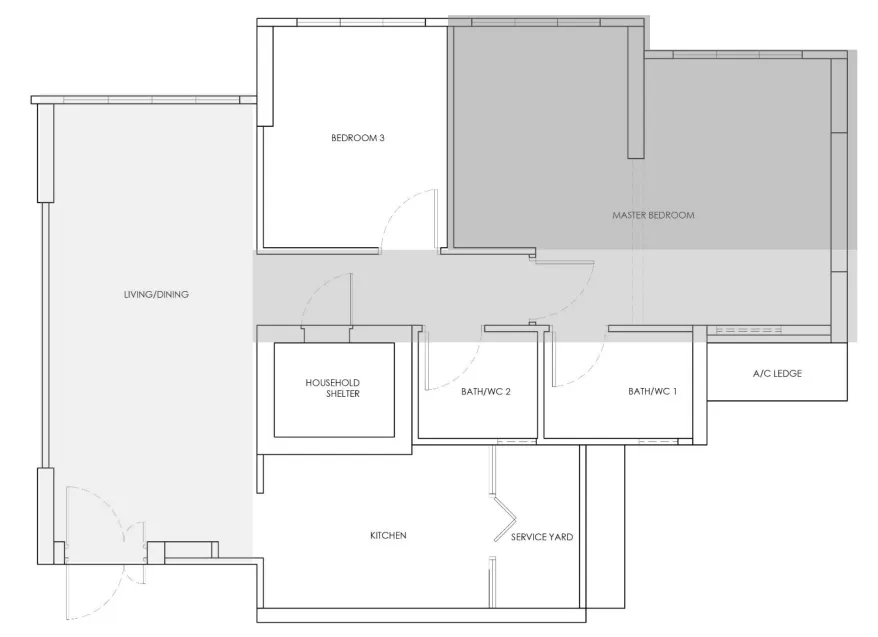 Eclipse-themed space usage, while maintaining a clean BTO home design
On a lighter note, PQ really was amused by the fifty shades of gray concept. It was quite a pity that was not the actual theme.
Settling the nitty gritty details
We had to sit down with Shao Jie for a third appointment, to hammer out what we wanted and what we didn’t. The total cost thus far has been around SGD 32k +2k, which brought us to around 35k. It was a cost I was fine with, but I wanted to keep costs low because I knew that things are definitely going to balloon if we don’t aim low first. We sat down with him and did extensive discussions. We cut out many luxury items that were good to have, but not necessary: curtain pelmets, tempered glass kitchen door, vanity top, MBR built-in table, and closed shelves for the wardrobe.
One of the big decisions we had to make was whether to hack the wall and make our MBR more spacious. We were originally sure that we would hack the wall. But N previously brought up a point that apparently it would affect resale prices as a potential buyer would only pay you for a 3-room flat price, due to it having only 2 bedrooms essentially. That was a big concern.
The two of us discussed this extensively. The question became whether it was worth the extra money to hack the wall and still take a financial hit eventually when we sell the house. We also thought of keeping the doors and just permanently locking it. But that was not such a good idea as there would still be one less wall. And the fact that we were turning BR2 into our wardrobe area meant that the door could not be opened; it would hit the wardrobe otherwise. We eventually decided that we should just throw caution to the wind and just hack the wall. The space was just too attractive to have.
Working design
We ended up with this:
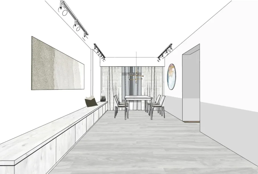 Concept Art
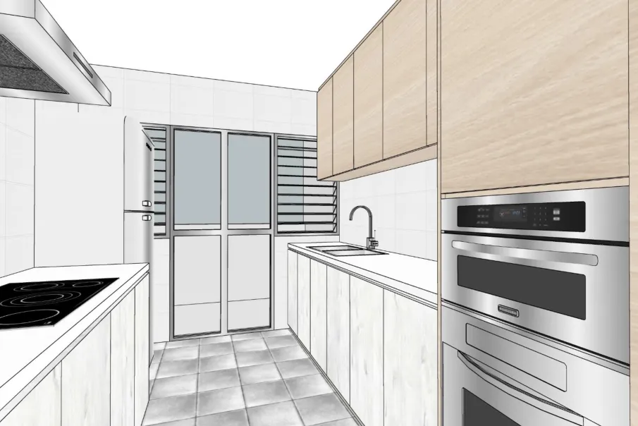 Concept Art
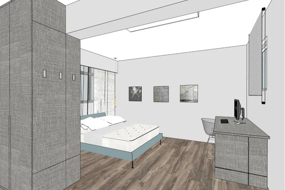 Concept Art
Shao Jie’s first draft concept pleased us. So everything that would come after was really going to be incremental improvements. It seemed like an awful long ago when we were trying to go for something that was industrial and little wood. I guess we never really know what we want until we understand what we don’t want. We really were noobs!
 Noob
Noob
The next step then is to fine tune the design while checking our furniture. We went to Taobao, Gain City, Harvey Norman, Hoe Kee, etc. The both of us exchanged ideas. But we couldn’t confirm the design or furniture until we could do site measurements. For that, we’d need the keys and check out the actual flat.